
Premium Medical Aesthetic Branding and Graphic Design
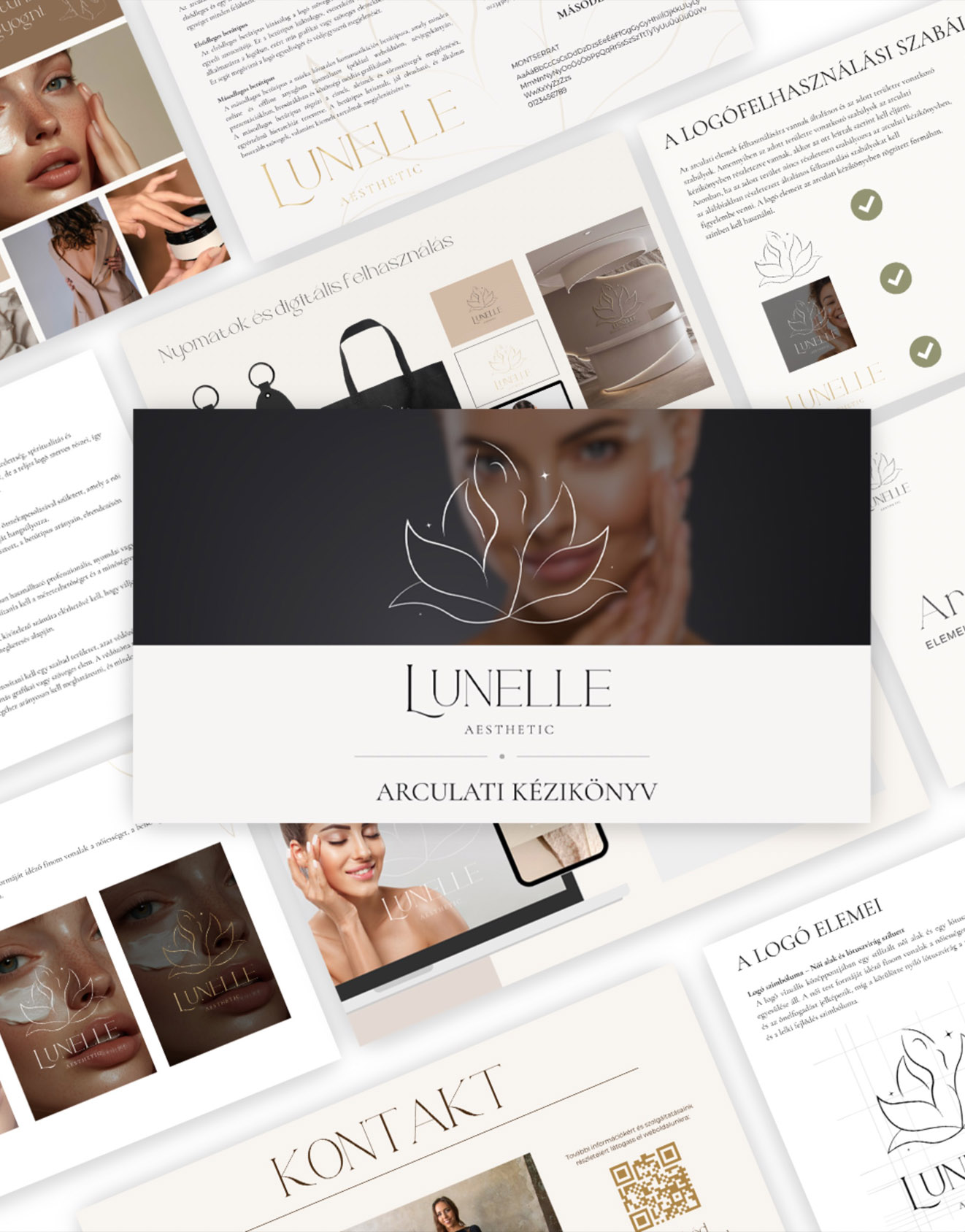
The Lunelle for me was always more than just a medical aesthetic clinic. From our very first conversation, Vivi wasn’t just looking for a "pretty logo" - she wanted a visual world capable of reflecting a philosophy where external renewal and internal balance naturally intertwine. This mindset guided the entire design process.
The brand name was born from the fusion of "luna"—the cyclically changing moon—and "elle", the delicacy of femininity. This duality defined the rhythm of the brand identity: modern medical aesthetics and a holistic approach, strength and softness, consciousness and sensitivity.
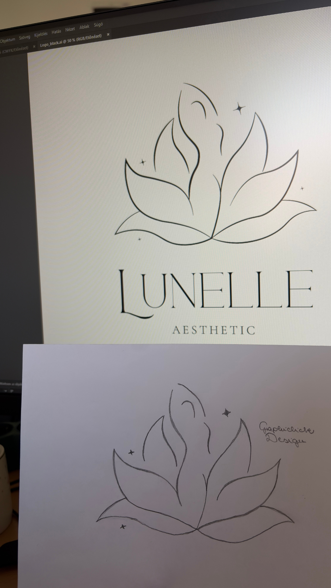
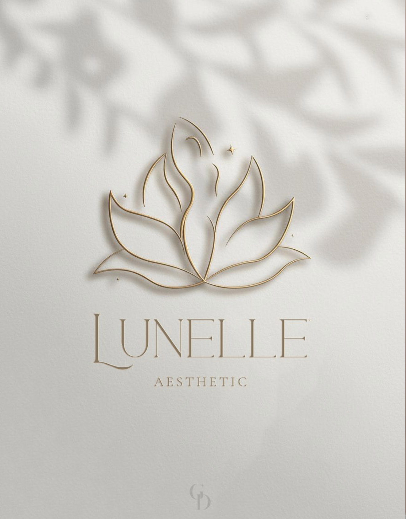
At the heart of the logo concept is a female figure emerging from a lotus flower. The lotus symbolizes purity, rebirth, and inner strength—the kind of beauty that isn't loud, yet is deeply present. The female silhouette isn't immediately obvious - it blends subtly into the flower's forms. It becomes truly recognizable only upon closer look, just like the Lunelle philosophy: understated, harmonious, and deeply present.
This subdued solution was a conscious decision. For Lunelle, beauty is born not from excess, but from harmony. The intertwining of the flower and the female figure conveys unity, authenticity, and inner strength, while its refined forms provide the brand with a premium and timeless appearance.
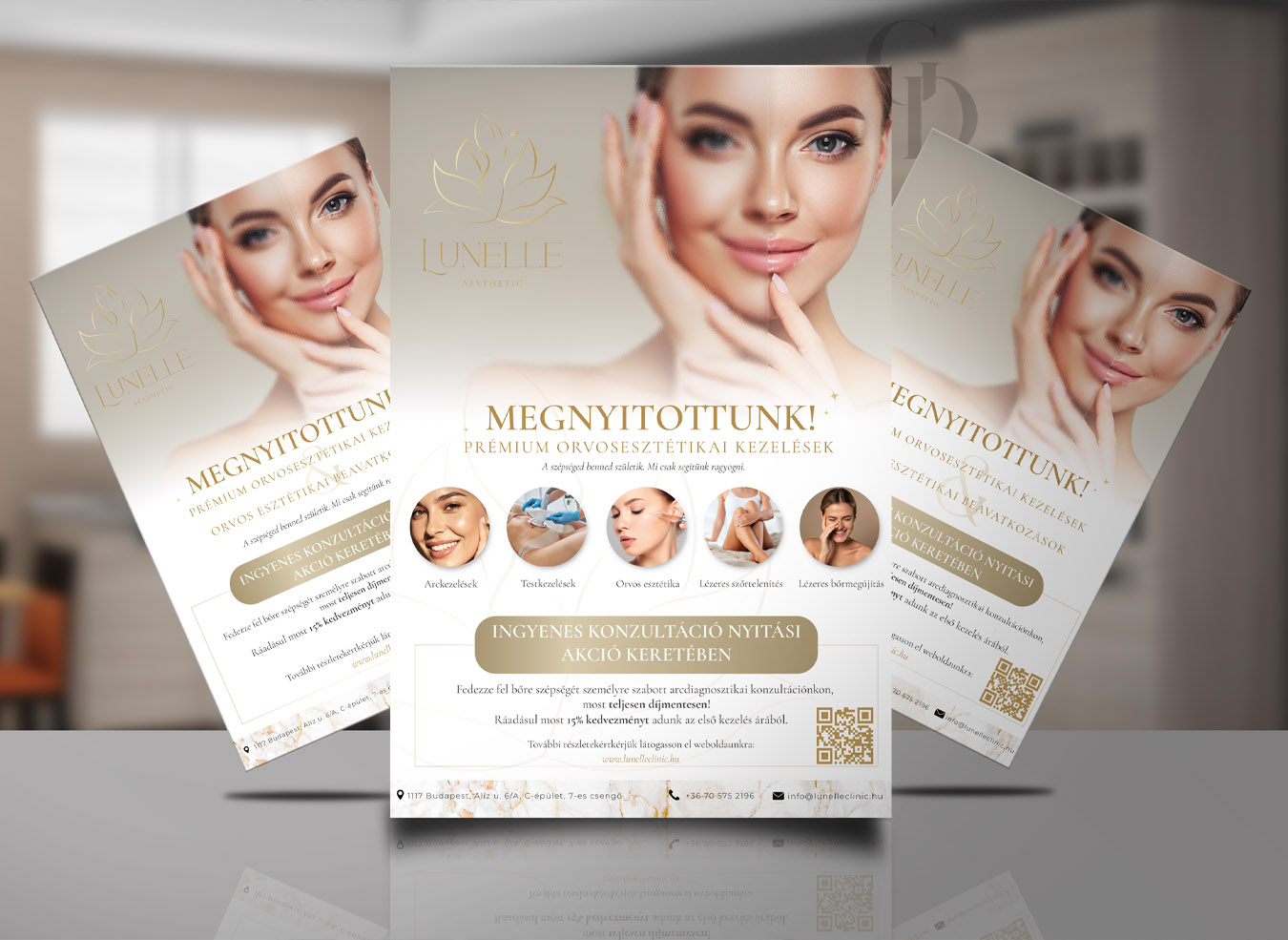
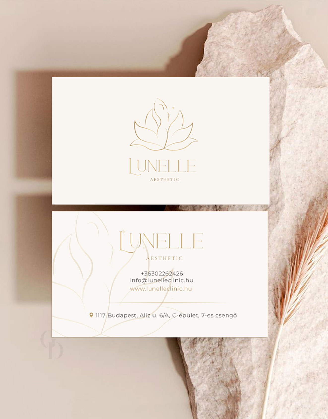
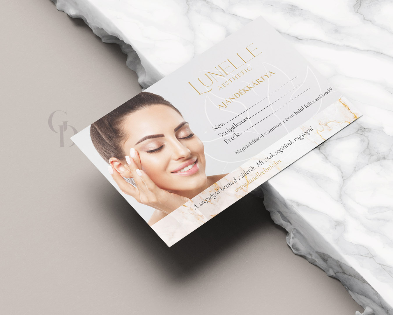
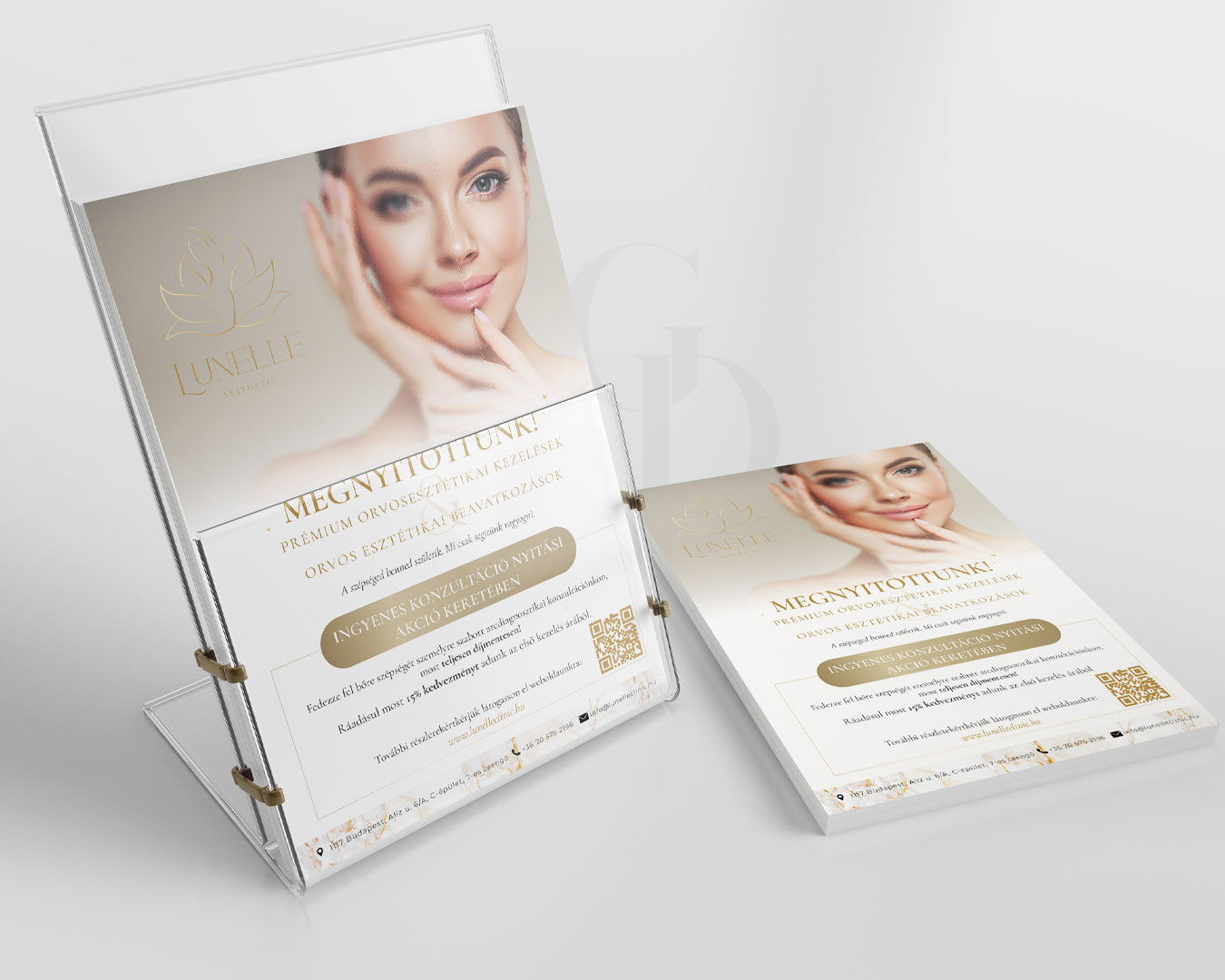
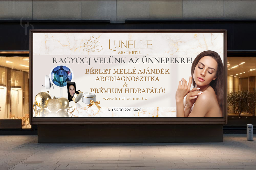
In addition to the visual identity, I created several graphic materials for Lunelle. These included business cards, for Vivi and the clinic, flyers, gift cards, and a billboard hat you might have seen on Egér út in the 11th district. For every element, it was vital that it wasn't just aesthetic, but radiated the same calm, safety, and feminine elegance that Lunelle represents.
For me, this project wasn't a classic branding exercise, but a shared journey of thought, where the intention and energy behind the brand could take true form.
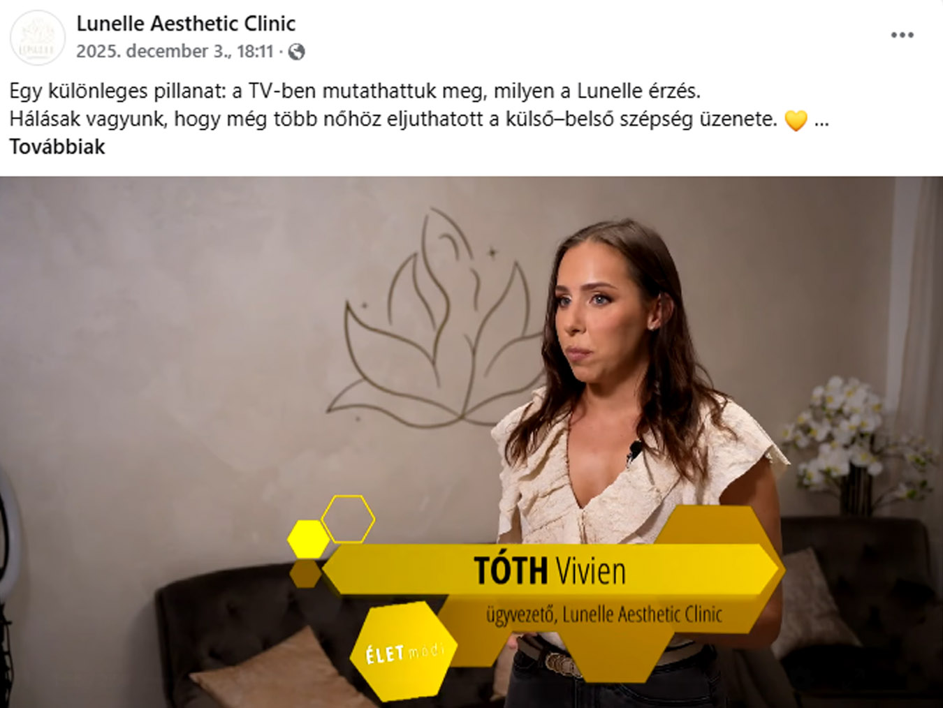
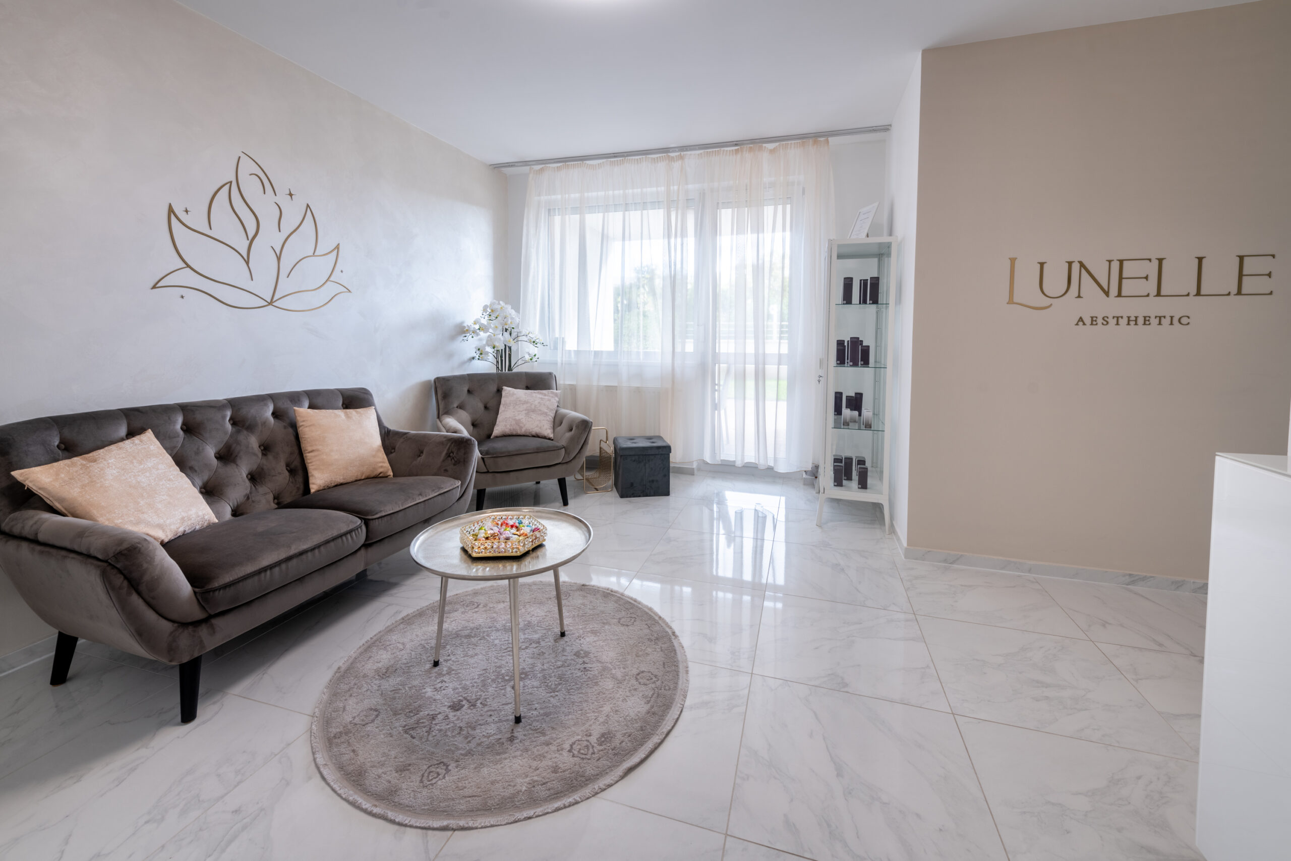
The featured interior image is from the official Lunelle website.
GRAPHICLICK DESIGN
CLIENT
A premium medical aesthetic clinic where natural beauty, modern technology, and a holistic approach meet.
CATEGORIES
- Brand Identity Design
- Logo Design
- Graphic Design
- Print Materials
PROJECT FOCUS
- Feminine, elegant premium aesthetic
- Premium, timeless brand identity
- Symbolic logo concept with deep meaning
- Visual representation of a holistic approach
The most important goal here was for the visual world to be more than just beautiful—it had to tangibly carry the calm and strength that Lunelle represents.