Brand identity design for a luxury event planning brand
Van der Vows is a San Francisco-based event planning and design studio that stood out from the very first moment. The founder comes from a chemistry background, so for her, connection is not just an emotional concept, but a system she understands deeply. This mindset provides the essence of the brand: invisible bonds, delicate balances, and consciously crafted moments.
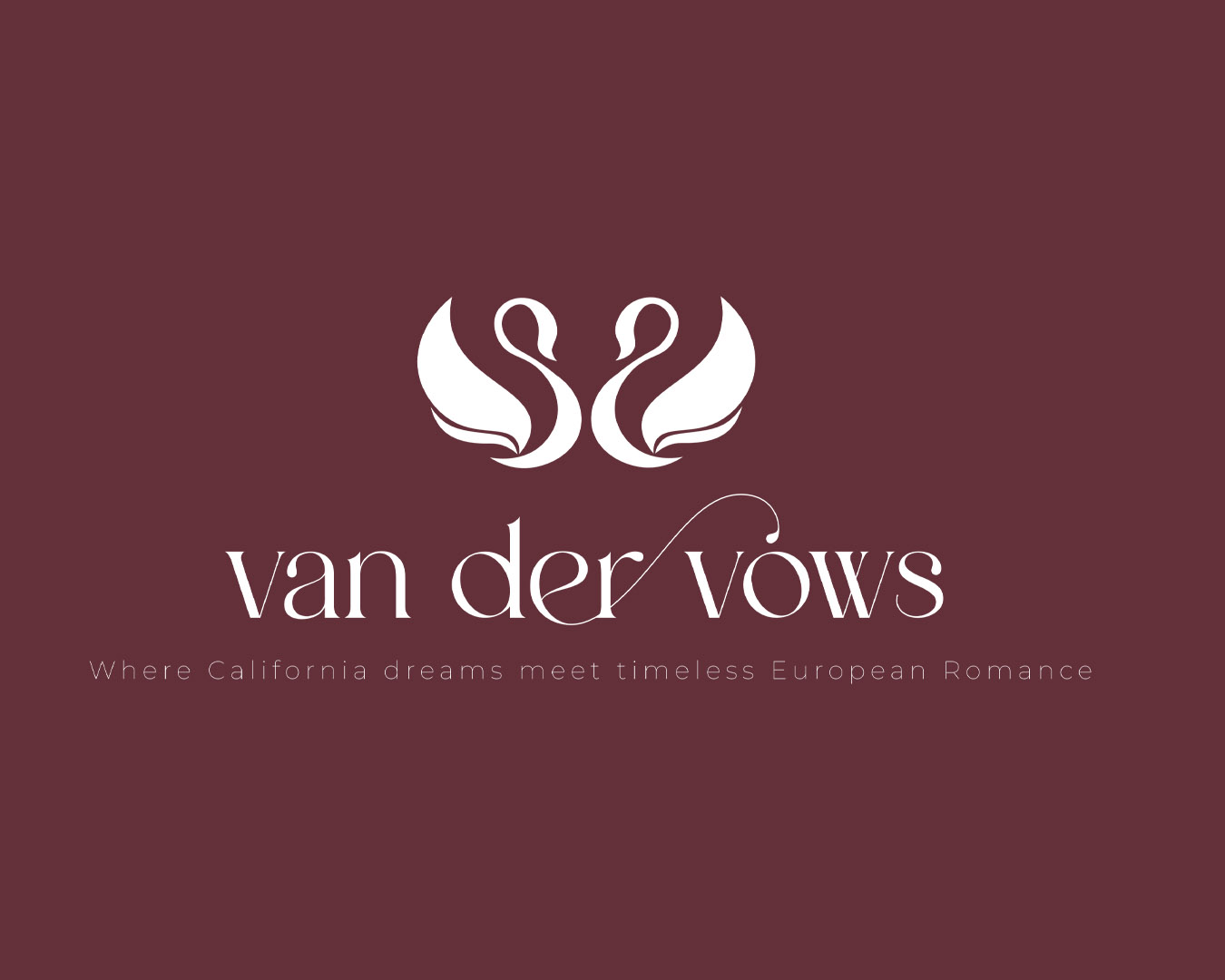
During our collaboration, my goal was to pour this unique perspective into a visual form. We created an identity that is simultaneously precise and emotional, elegant yet personal. The name Van der Vows refers to Van der Waals forces—those tiny, almost imperceptible connections that nevertheless hold everything together.
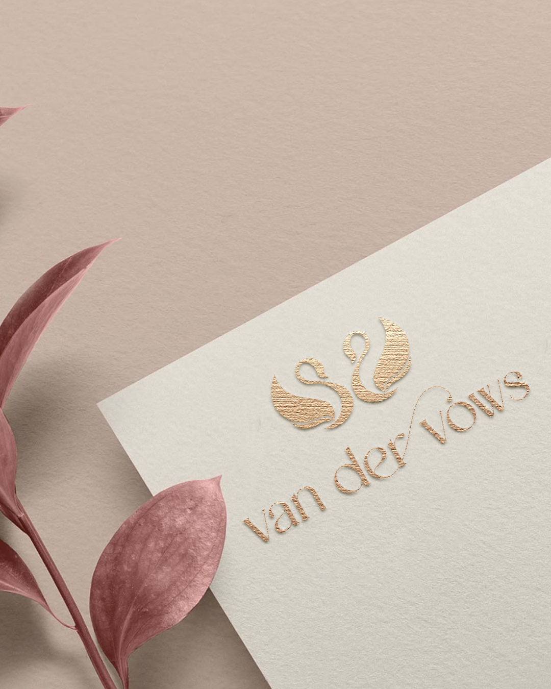
The central element of the logo is the letter V, formed by the bodies of two swans facing each other, referencing both the name and the meaning of "vows." It was given a clean, timeless shape that provides a stable foundation for the brand while allowing space for emotional layers.
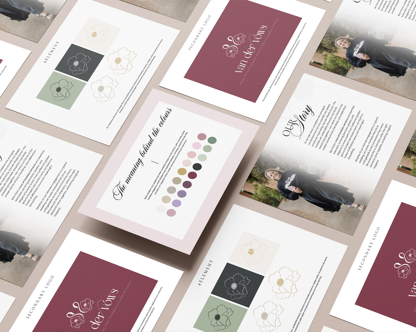
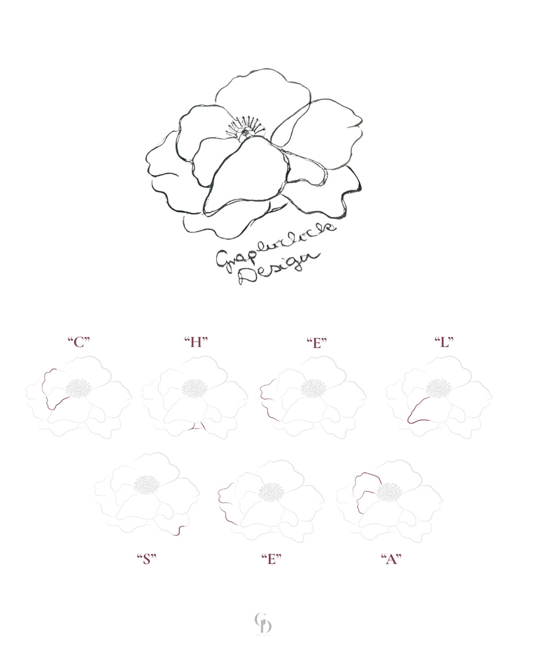
A separate graphic element was also created featuring Chelsea’s favorite flower, the poppy. Her initials appear subtly, almost imperceptibly, within it, making the motif truly personal and storytelling-driven.
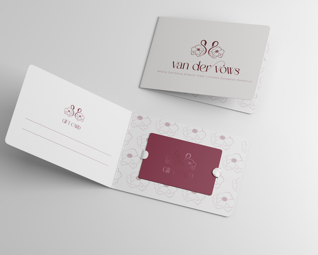
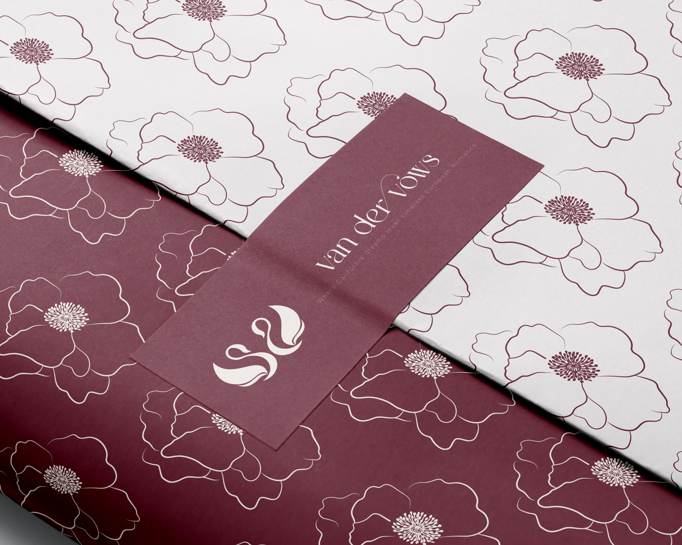
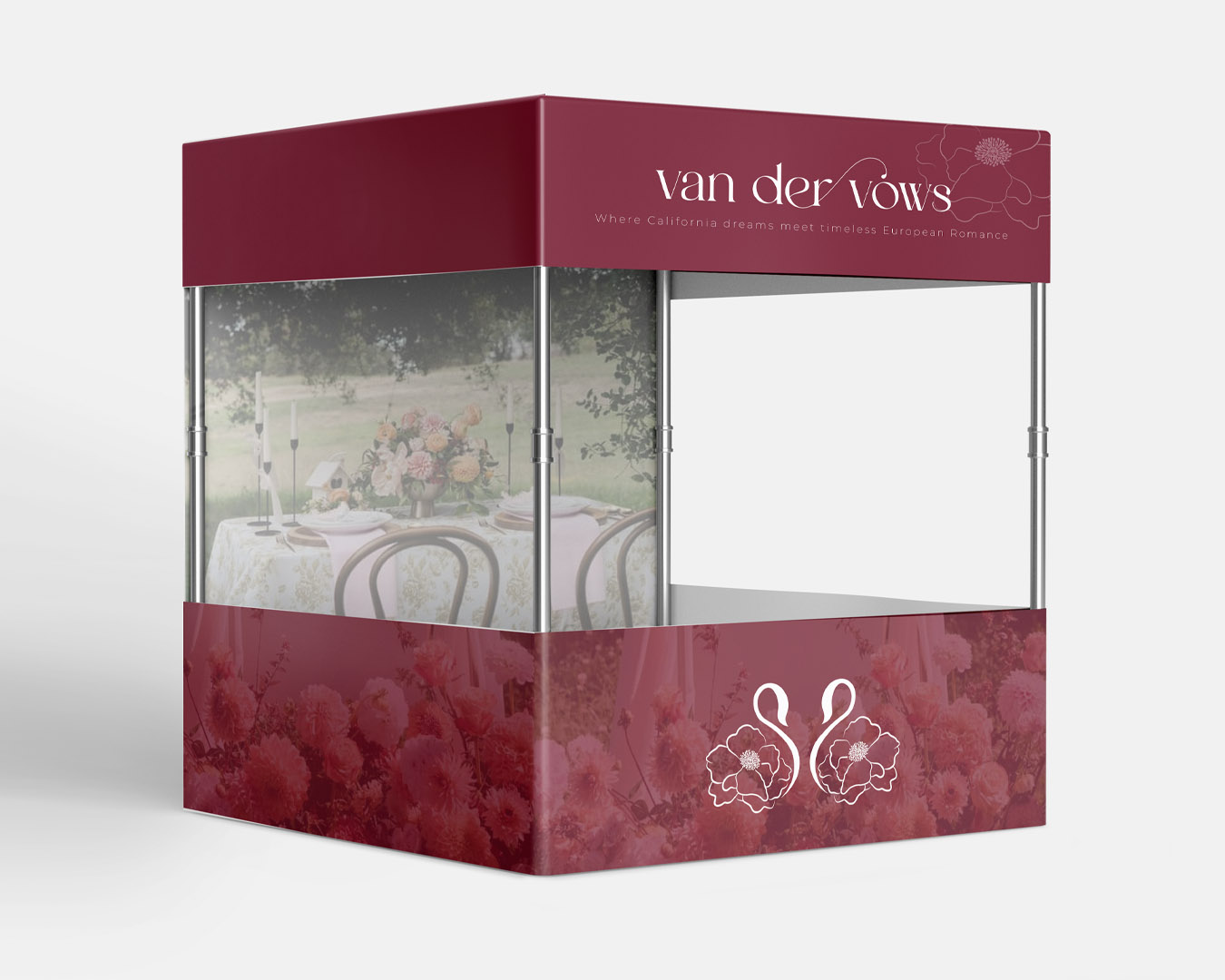
A secondary logo was born from the combination of the flower and the swan. The swan represents elegance, loyalty, and timeless beauty, while the organic forms of the flower bring softness and emotional depth to the identity. This duality resonates perfectly with the brand’s world and allows the identity to work effectively in both the American market and Europe, as it now expands to Budapest.
The entire visual system—logos, graphic elements, and social media presence—conveys the feeling that behind every event lies conscious planning, precision, and genuine connection. Scientific thinking, elegance, and emotional presence in perfect balance.
GRAPHICLICK DESIGN
CLIENT
A luxury event planning and design studio founded in San Francisco, focusing on emotional connection and precise execution, with an international presence.
CATEGORIES
- Brand Identity Design
- Logo Design
- Graphic Design
- Social Media Materials
PROJECT FOCUS
- Feminine, elegant premium aesthetic
- Balance of emotional and professional content
- Delicate, floral graphic world
- Unique, storytelling identity
- Design that works in an international environment
It was particularly inspiring to work on a brand where Californian ease and refined European elegance are present simultaneously—and where a bit of the Hungarian perspective acts as a bridge between the two worlds.