Maximum Language School – Rebranding & Strategic Redesign
The Maximum Language School rebranding’s primary goal was to create a visual identity that breaks away from traditional educational clichés and projects the image of a modern, international-standard brand. The project focused on clearing away a cluttered, chaotic symbol system and condensing the brand’s message into a single, razor-sharp metaphor.
The Problem: Visual Noise and Inconsistency
The legacy logo was a classic "over-designed" concept: geometric shapes, a book icon, and a lightbulb were all fighting for attention, resulting in constant visual noise. Furthermore, the purple-green color palette felt more like a tech startup than a trust-based educational institution.
The Solution: Strategic Simplification
The new concept is built on the idea of "Language as a World." Instead of using literal flags—which often make a composition feel clunky and dated—I opted for a symbolic approach:
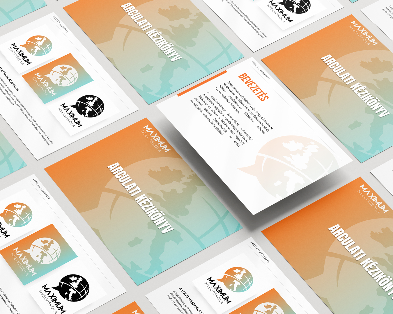
Symbolism: The core of the mark is a fusion of a globe and a speech bubble. This shape simultaneously communicates global opportunity and speech-centered, interactive learning.
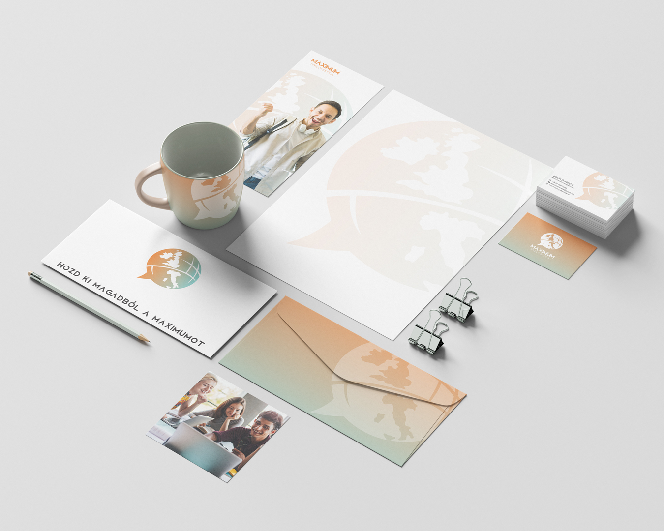
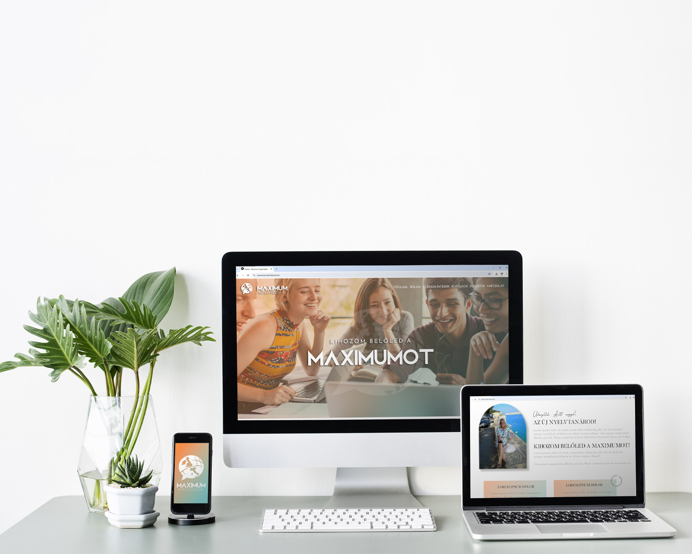
Geometry: The circular foundation suggests unity, stability, and structure, ensuring the logo remains instantly recognizable across all platforms, from social media icons to business cards.
Color Psychology: I utilized the complementary contrast of vibrant orange and deep turquoise. The orange represents the energy and motivation essential for learning, while the turquoise provides professional credibility and a sense of calm.
The Result
A coherent, modern, and timeless identity that not only differentiates the school from its competitors but also visually reinforces the "Maximum" quality promised by its name.

GRAPHICLICK DESIGN
CLIENT
A language school that stands out through personalized programs and modern teaching methodologies. Their mission is to provide an enjoyable, effective, and motivating learning experience for every student, from absolute beginners to advanced learners.
CATEGORIES
- Brand Identity Design
- Logo Design
PROJECT FOCUS
- Logo Redesign
- Modern, Youthful Visual Identity
- Strengthening Brand Positioning
- Unifying Visual Communication
Most language schools stop at flags and books, but I wanted to build a brand, not just an illustration. The goal was for the logo to represent more than just the subjects taught; it should convey the experience of how language opens up the world. I love that the final result is clutter-free, yet says everything it needs to.