A wedding where every detail is personal
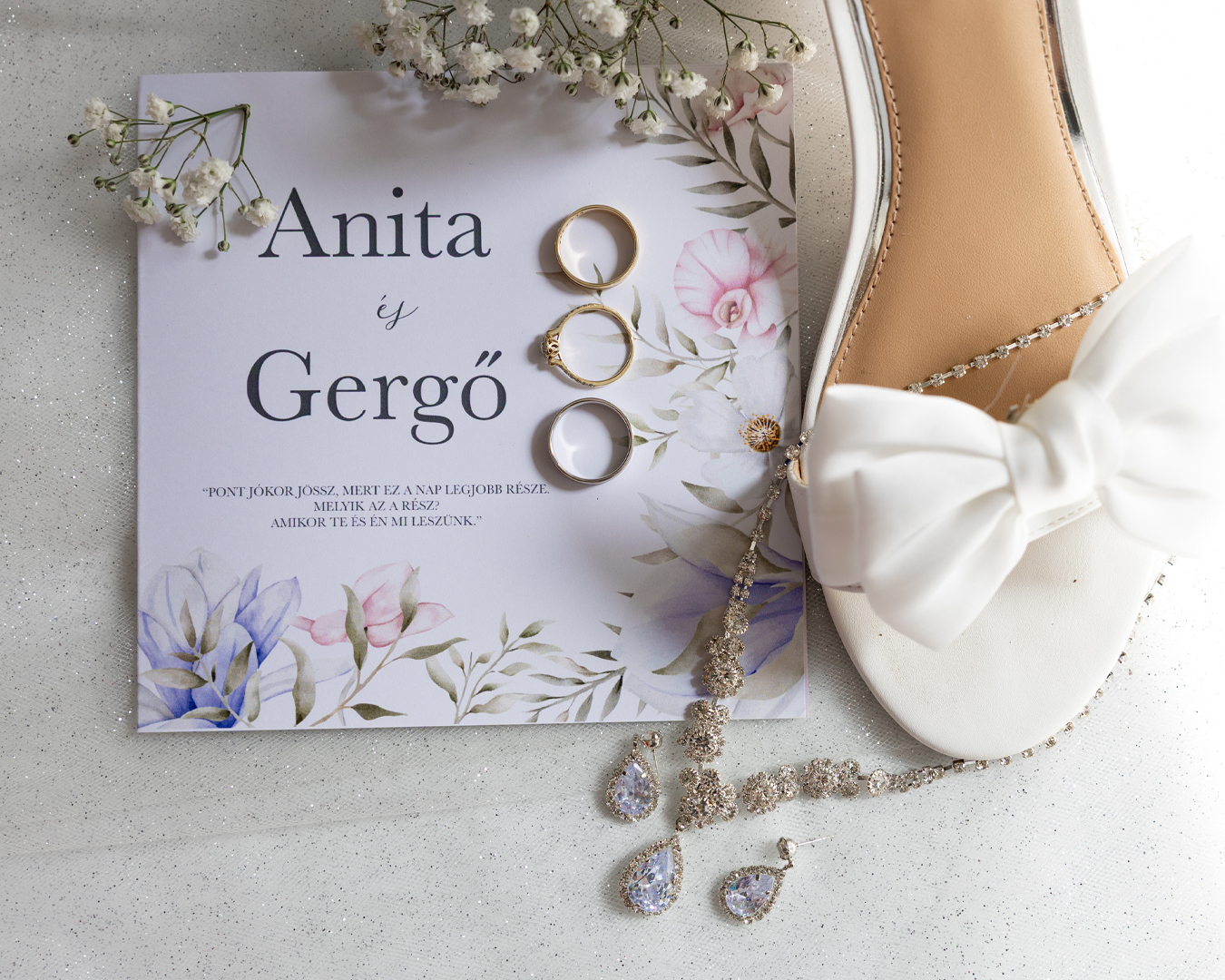
his project holds a special place in my heart, as it is connected to our own wedding. Here, there was no client brief, no deadline negotiations, or multiple rounds of revisions. It was just us, our taste, and the desire for every tiny detail to truly reflect who we are.
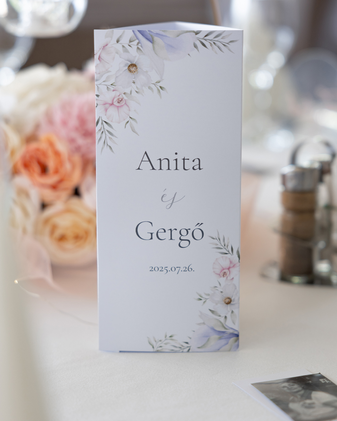
The foundation of the visual world was clarity and timeless elegance. Powder pink shades, delicate blue details, and a touch of romance—which, if I'm honest, will probably come as no surprise that
I was heavily inspired by the world of the Bridgerton series. (The truth is, I’m a huge fan!)
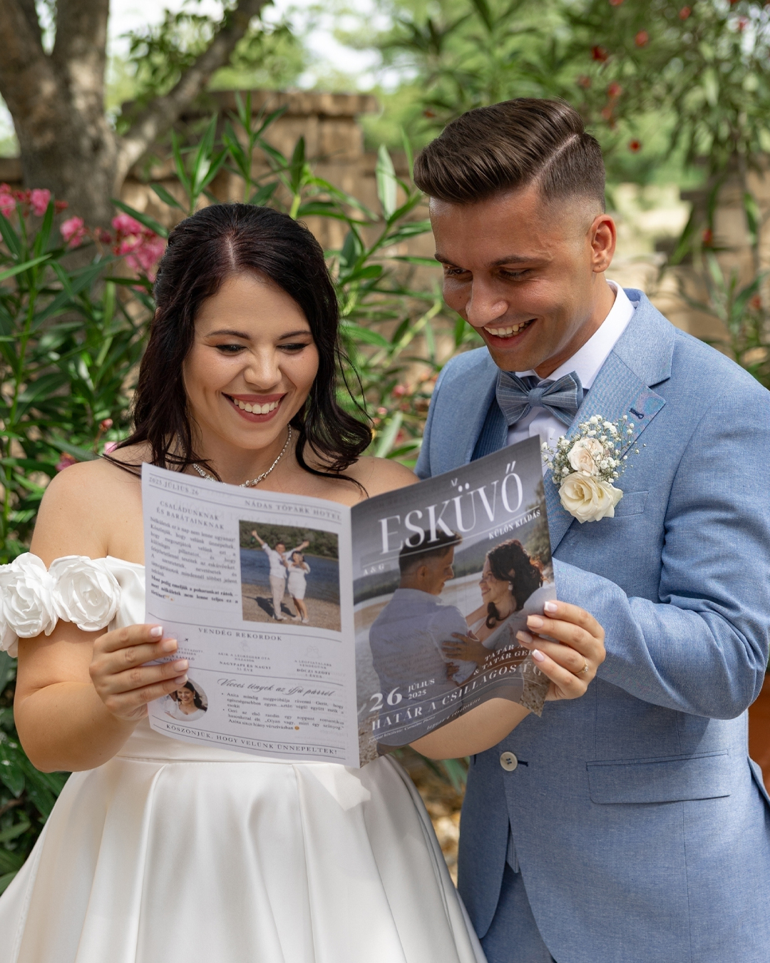
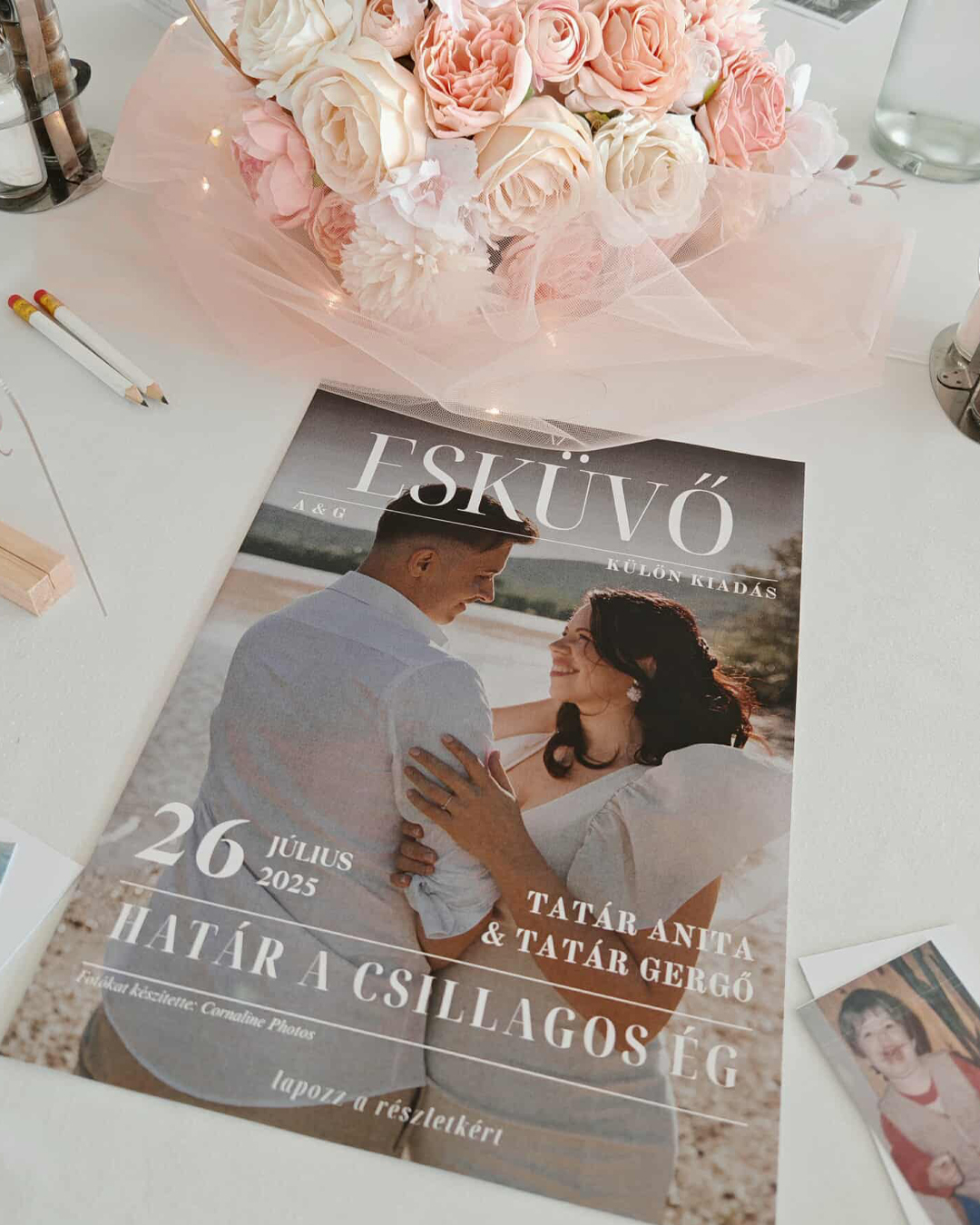
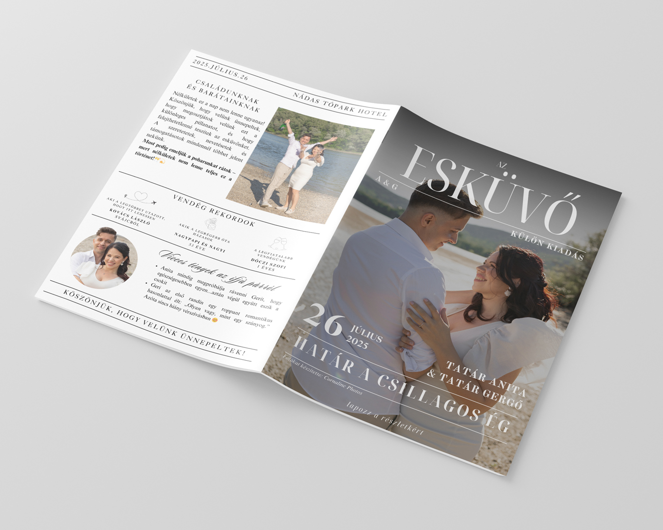
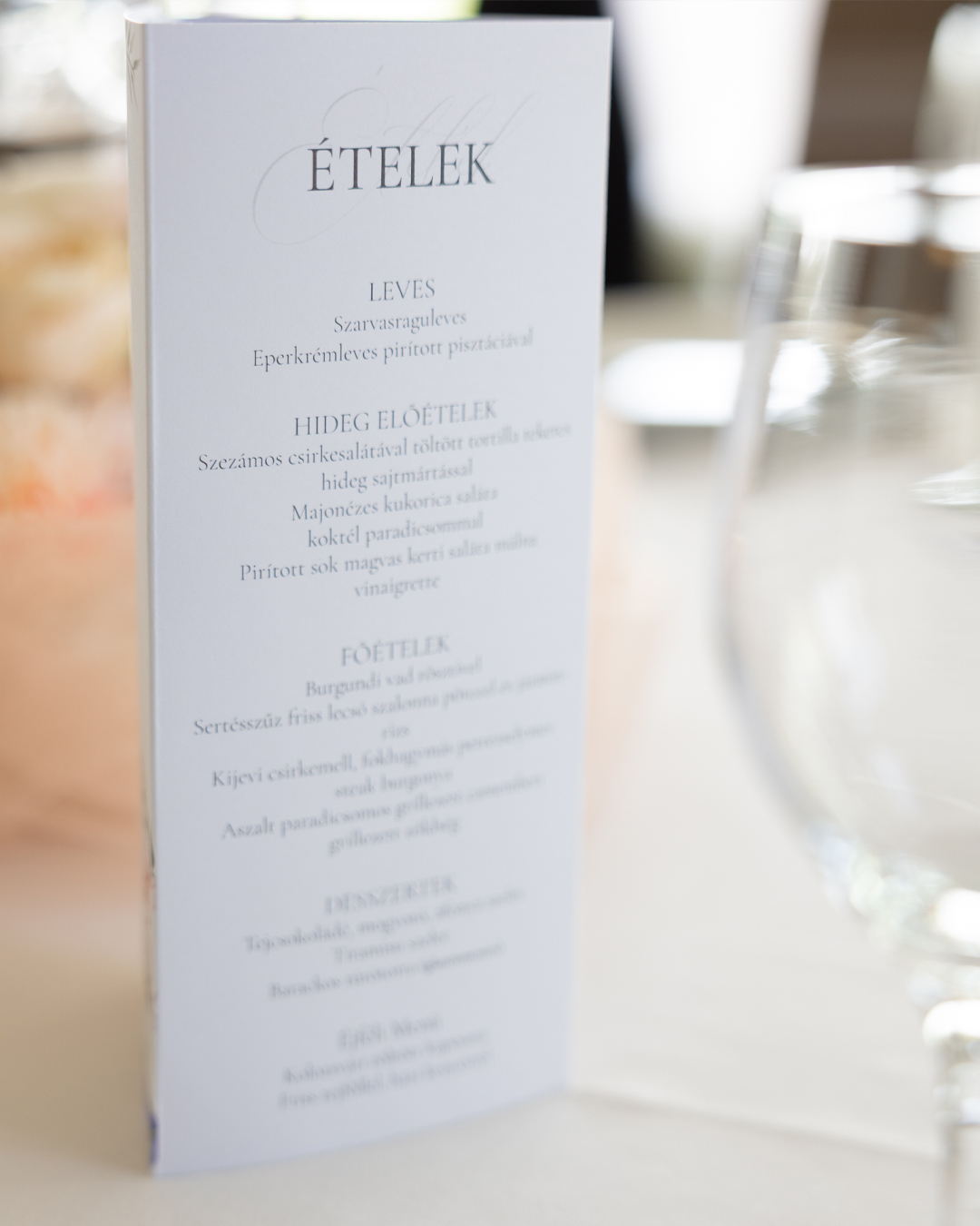
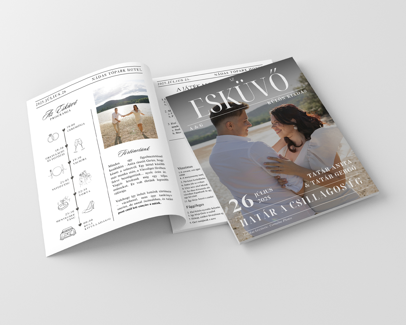
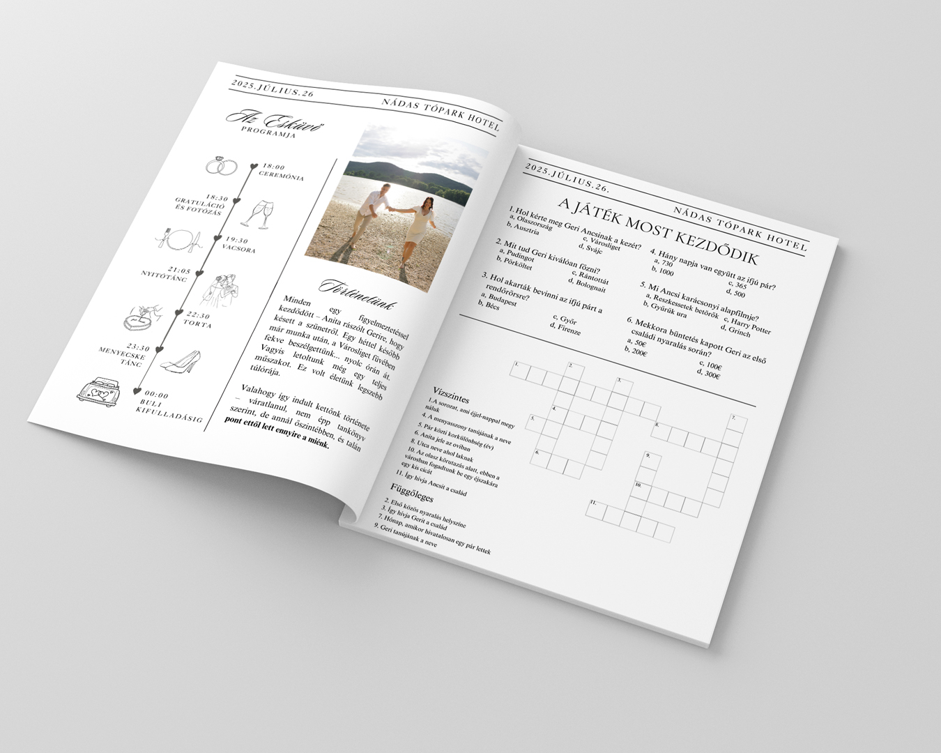
From the invitation and the menu to the place cards, seating chart, and wedding magazine, every graphic element told a cohesive story. It was important to me that these pieces weren't just beautiful, but that they provided an experience—items that were a joy to hold, flip through, take home, and look back on with a smile years later.
The wedding magazine is particularly close to me. It wasn’t just printed material - it was a little world for our guests, filled with stories, atmosphere, and personal details.
A small gift that reached beyond the big day itself.
The photos were captured by the brilliant Cornaline Photos who caught every moment with incredible sensitivity, while ElenaVirág Budapest was responsible for the decoration. Usually, graphic design is adapted to the decor, but in our case, the decoration was tailored to the graphic elements—and the overall result was simply magical.
Every decision here was born from the heart, and that is exactly why it became truly timeless. 🤍
GRAPHICLICK DESIGN
CLIENT
- Anita & Gergő (our wedding)
Bridgerton-inspired wedding accessories for our own wedding.
CATEGORIES
- Graphic Design
- Wedding Stationery
- Brand Identity Design
- Magazine Design
PROJECT FOCUS
- Creating a unified visual world
- Invitation and wedding print materials
- Emotional experience and detail-oriented appearance
Quite literally, this was my true passion project.