
Premium brand identity and minimalist website
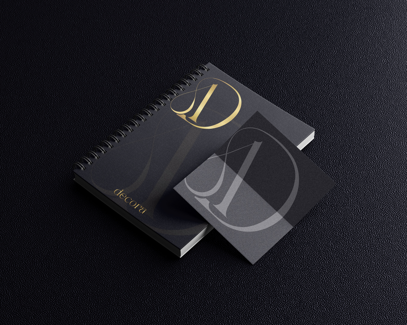
The Decora the primary goal was to establish a visual world that conveys the exact elegance and quality the business itself represents. The abstract, artistic nature of decorative walls defined the logic of the entire identity: no two surfaces are alike, yet every work is instantly recognizable.
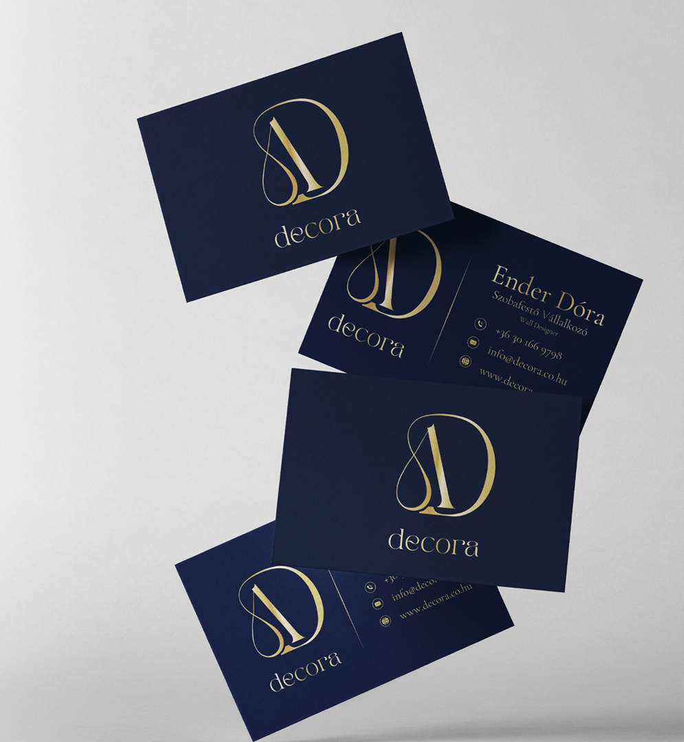
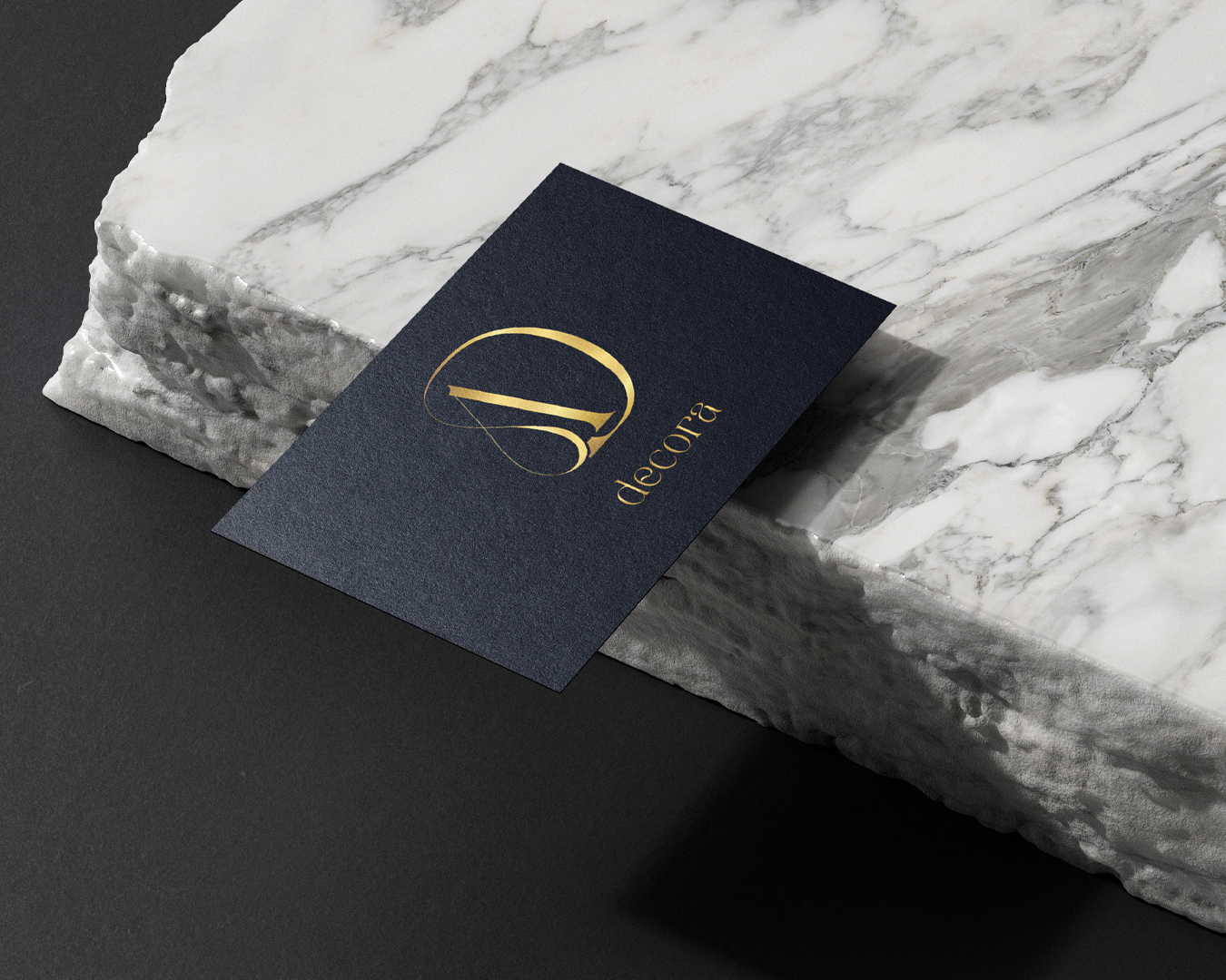
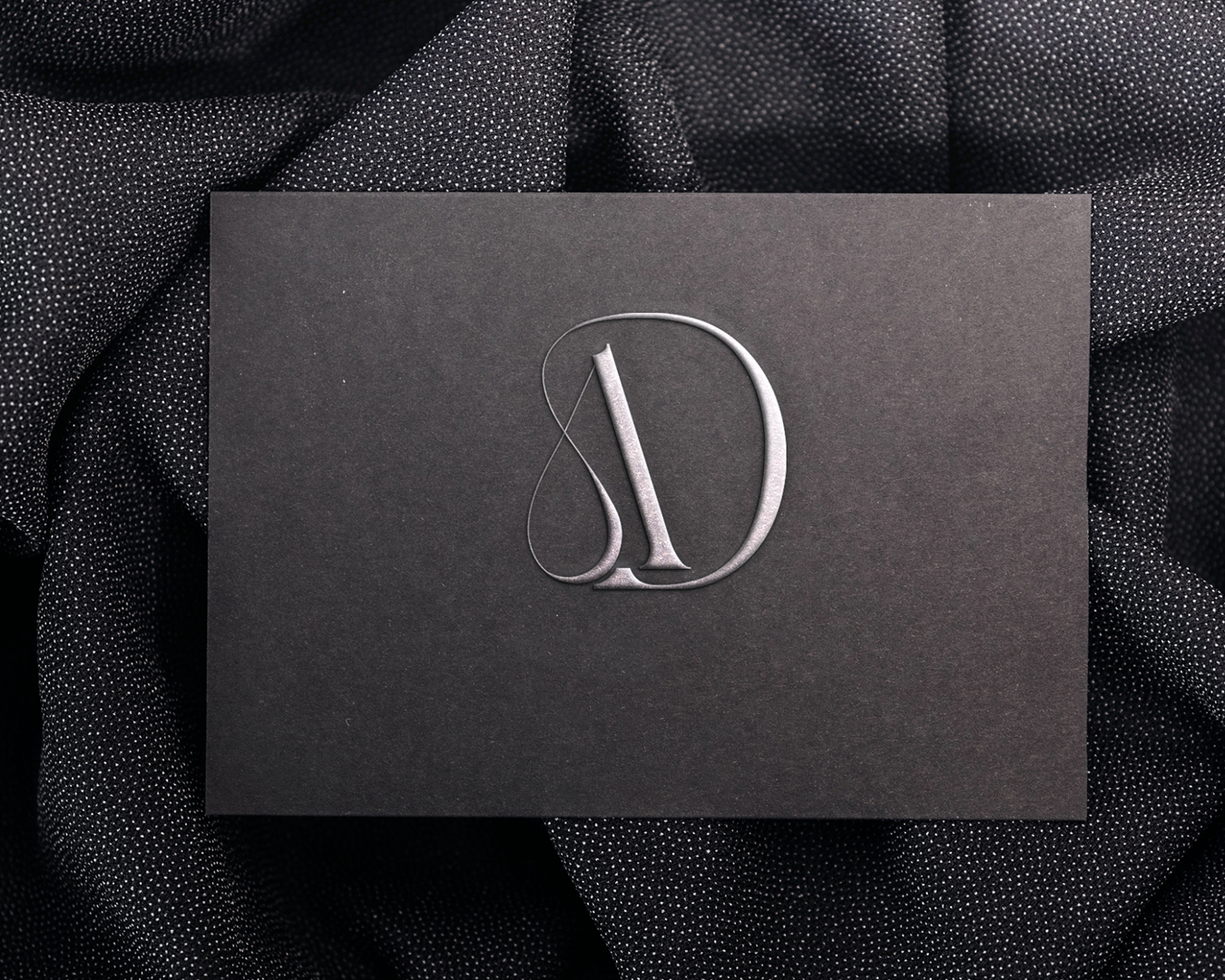
During the logo design process, the original request was for a circular form, but we took this a step further. Since shapes in abstract painting are never perfectly regular, we moved away from a classic circle and took inspiration from typography. The curve of the letter "D" subtly transitions into the "A," referencing both the brand name and creative freedom. Interestingly, the client’s name, Dóra, is also reflected in this solution, making the logo personal yet timeless.
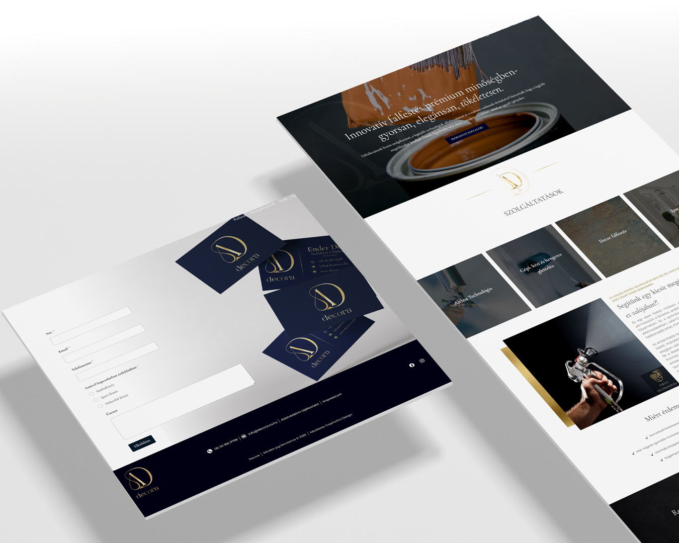
The color palette is intentionally understated: the combination of gold and navy blue creates an elegant, premium feel while allowing the visuals of the decorative walls to take center stage. Every element of the identity reinforces this duality: clarity and character, delicacy and decisiveness
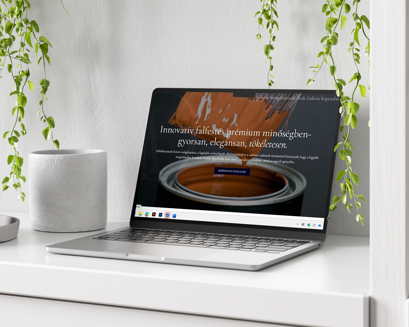
For the website design, minimalism took the lead. The goal was to ensure everything is easy to find by completely eliminating visual noise. At the client’s request, the landing page features only the logo set against a gold-glittered background, which immediately establishes a premium experience and piques the visitor's curiosity. This restrained opening fits the brand’s character perfectly, allowing quality to speak for itself.
For me, this project is a prime example of how an artistic service based on unique textures can be transformed into a modern, conscious brand without losing the freedom of creation..
GRAPHICLICK DESIGN
CLIENT
A premium painting and decorative wall business where precise execution meets abstract art. Clean, durable solutions for modern and elegant spaces.
CATEGORIES
- Logo Design
- Brand Identity Design
- Website Development
- Graphic Design
PROJECT FOCUS
- Designing a logo and identity that subtly yet firmly conveys the uniqueness of abstract decorative walls
- Clean, modern appearance
- Establishing a premium brand identity
- User-friendly interface
- Timeless and characterful imagery
- A balance of elegance and artistic freedom
I wanted the visual world to reflect the exact tranquility and quality that their work represents.