Logo and website redesign for a renewing beauty salon
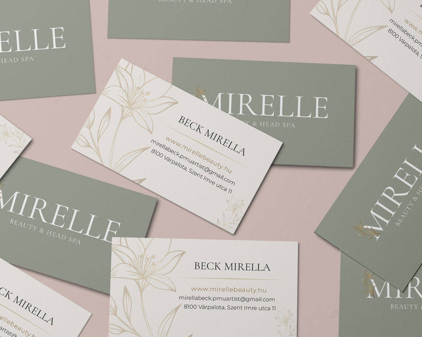
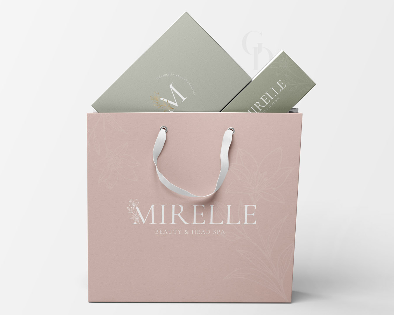
The Mirelle Beauty & Head Spa it wasn't about the birth of a completely new brand, but rather the evolution of an already well-functioning foundation I had designed the original logo and website two years prior, but since then, the salon has undergone a significant transformation. New services were introduced, they moved to a new space, and the brand name itself changed. Refreshing the visual identity was a natural step in this growth.
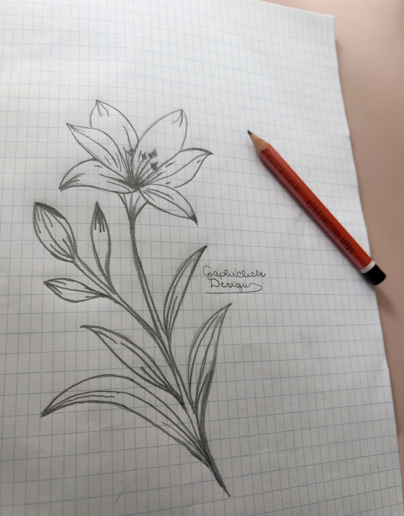
The goal was to create a more modern, cleaner look while retaining the elements that clients had already grown attached to. he central element of the renewed logo is the letter M, which incorporates a hand-drawn lily. The lily is a symbol of renewal, purity, and femininity, additionally, it is Mira’s personal favorite, giving the mark both professional and personal meaning.The hand-drawn element makes the identity more approachable and serves as a conscious counterpoint to the overly sterile looks typical of the beauty industry.
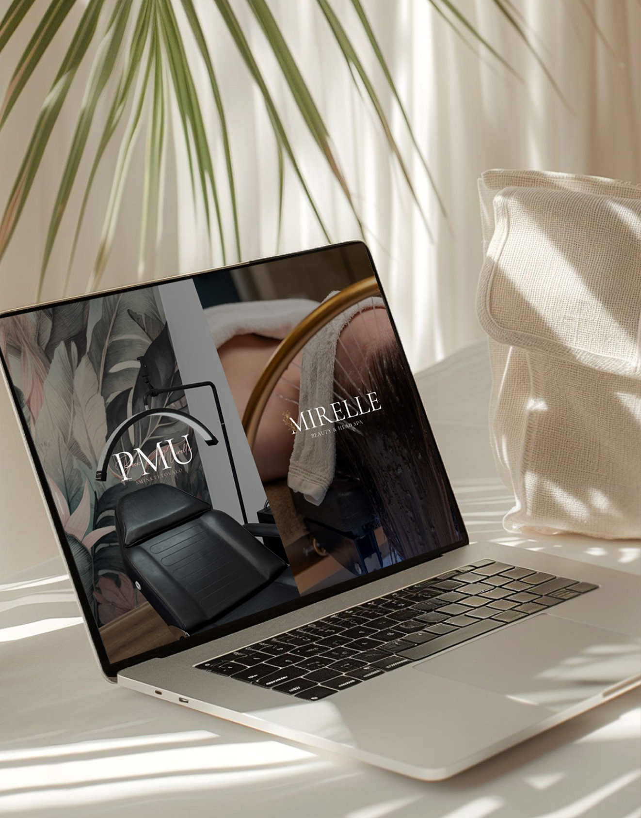
During the website design process, several directions emerged. The original domain was still linked to the previous name and focused exclusively on permanent makeup, while the Head Spa had since grown into a strong, independent service. We considered creating two separate websites or keeping everything on one platform. The final solution was a structure that is both transparent and full of character.
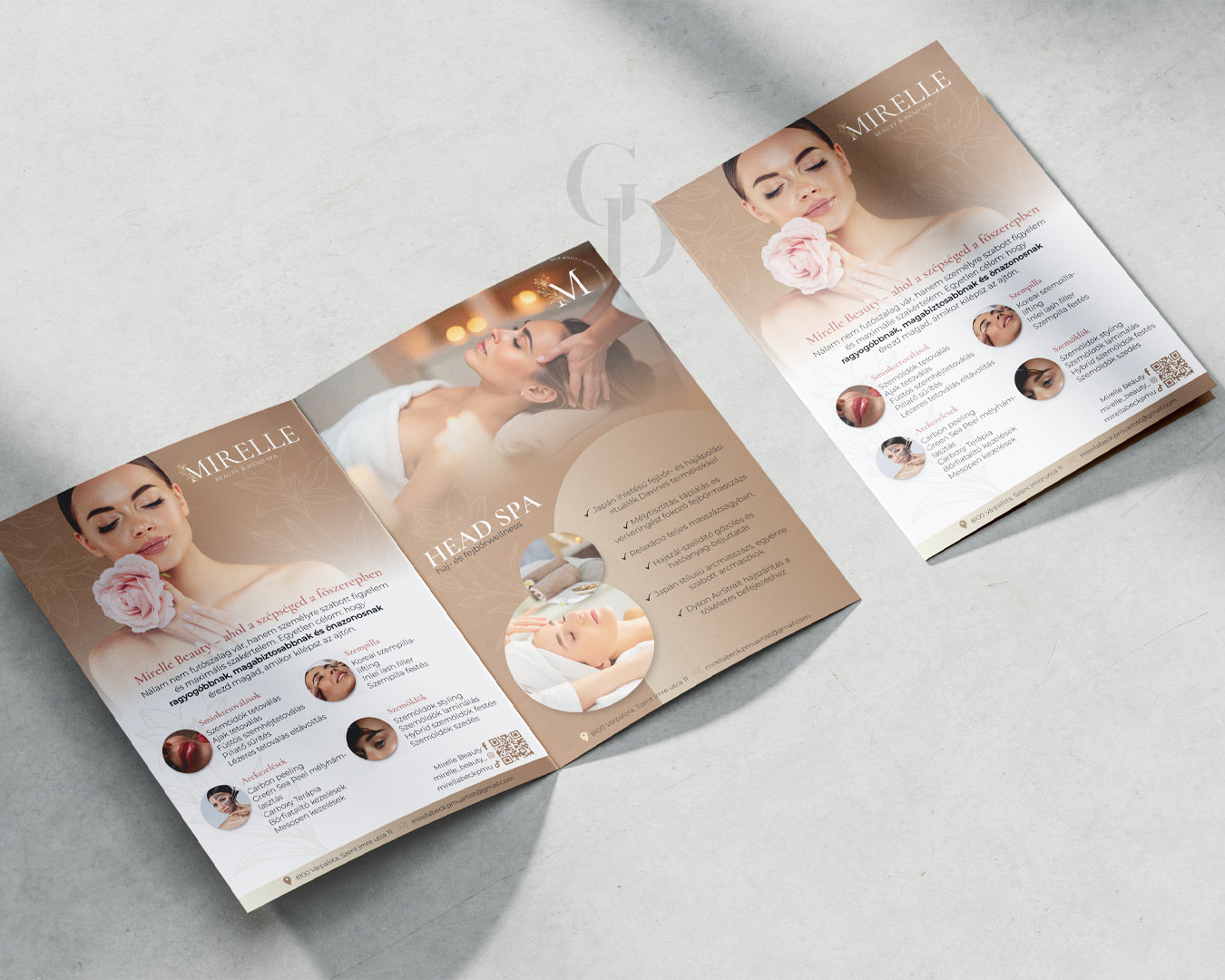
On the home page, the two services are separated both visually and through content. Permanent makeup retained the successful elements of the previous look, while the Head Spa was given a world built on green shades, emphasizing tranquility and regeneration. Visitors can decide in the very first moment which service interests them and reach that section directly, even as the entire site functions as a unified system.
This layout is not only visually exciting but specifically user-friendly. It handles a large amount of information simultaneously without overwhelming the visitor, allowing everyone to navigate the services according to their own needs.

GRAPHICLICK DESIGN
CLIENT
A beauty salon specializing in permanent makeup and Head Spa treatments, where professional precision and rejuvenation go hand in hand.
CATEGORIES
- Brand Identity Design
- Logo Design
- Website Design
- Graphic Design
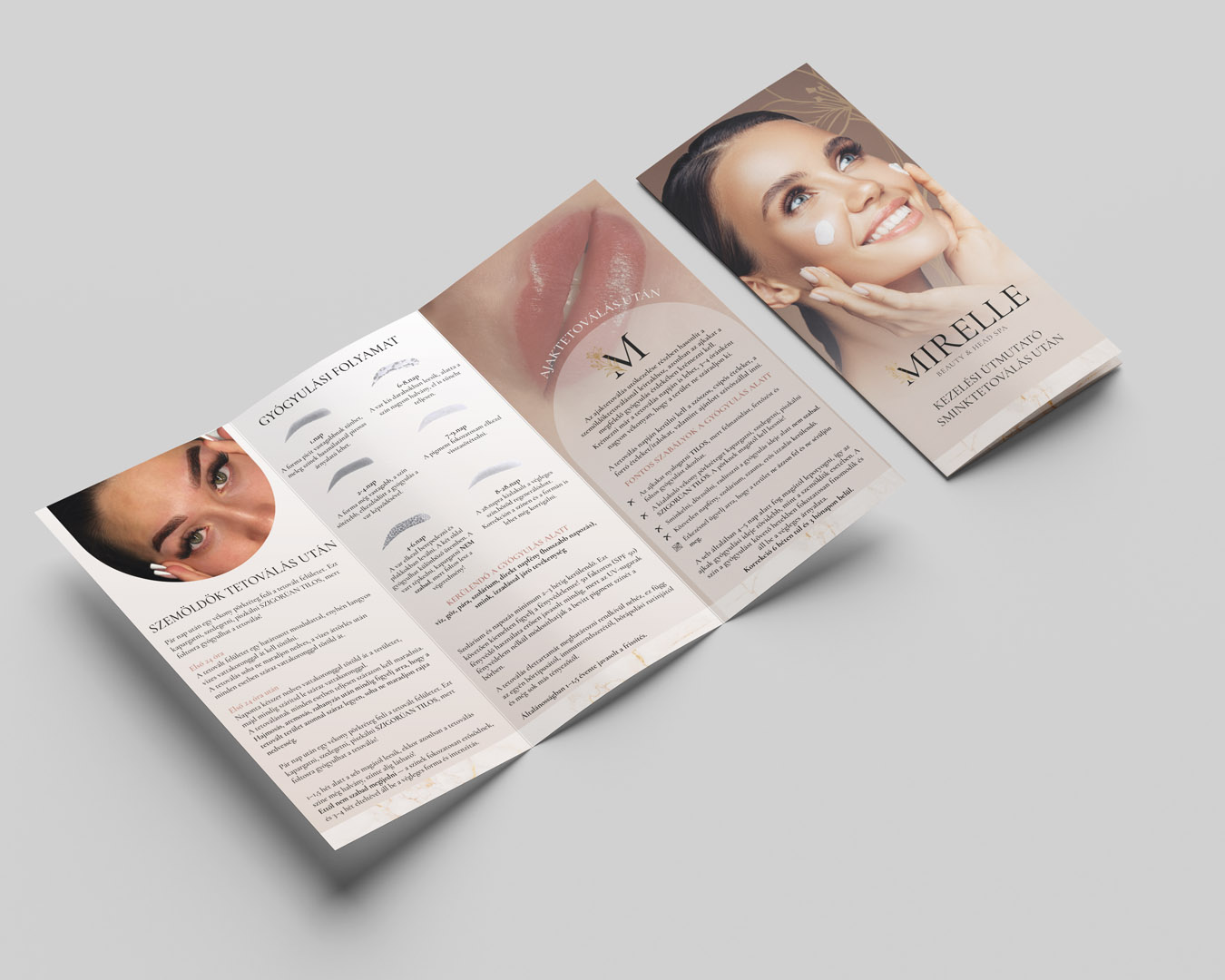
- Print Materials
PROJECT FOCUS
- A renewing yet recognizable brand
- Multiple services on a single website
- Transparent, user-friendly structure
- Visually distinct service branches
I love projects where I don't have to start everything from scratch, but rather subtly reshape what already works.